Hi!
I haven't blogged in awhile. I'm looking to start back up. I say that every time I want to start blogging again. Time is hard to find, but since I'll be working from home for the foreseeable future, why not begin again?
Since the last time I blogged, I have moved to an eCoach / Innovative Learning Specialist role for Five Star Technology and am housed in the same district that I taught in. I get to help teachers create awesome learning experiences for students. It's so fun. I never know where or what I'll end up helping with each day.
Because of my background in design, I wanted to focus on some things that I can show to help teachers out that have now been forced to work everything online.
Here it goes:
Online Lesson Design
As teachers have shifted towards online / virtual / e / home / etc. learning, I thought I'd help out and share some tried-and-true design fundamentals to help with online lesson design. This is not an end-all-be-all type of list, but there are some small changes teachers can do to help learners learn.Also, most people will probably call these Design Principles. I'm going to call them Design Fundamentals. They are like building blocks and you can get better at them.
Up front: My definition of designer.
You are a designer if you create anything. You don't have to have a fancy title to design things. You designed that turkey sandwich you're having for lunch today. You designed your hair today. You designed that route you took to school today. If you create something, you are a designer. You're creating learning experiences. You're a designer.
Yes, you're a designer. Now that you know that, let's dive into some design fundamentals.
Because I've really gotten into sketchnoting, I decided to sketch it out.

Disclaimer - If you are currently doing any of the things mentioned below, don't take it personal. I used to struggle with some of them. I still do with some. I don't necessarily follow them to a "T." There are no definites. I'm just trying to help you be more aware of these. Jake Miller quotes this Maya Angelou quote all the time and it applies here: "Do the best you can until you know better. Then when you know better, do better."
Good Visual Communication
You've just been kicked out of your classroom for the next who knows how many months, you've got to transition to doing everything online. Your lesson plans. Your assessments. The way you deliver your content. The way you interact with students, parents, etc. You are stuck. You don't know where to begin.
There are 10 fundamentals of design that I'm going to focus on for this. In reality, they can all be boiled down to "Good Visual Communication." As you read through these 10 items, see if there are things that you can start implementing now to help communicate with your students better. I say your students, but what I really mean is people in general. These are good for any means of communication.
Think of it this way: People don't notice good design. It just flows. It's easy. People's brains don't have to work hard to figure it out. Have you ever been in an unfamiliar heavily crowded place? An airport in a foreign country? A sporting event? A subway? An unfamiliar city? How much did you rely on way-finding signs? Were they easy to find? Could you understand them? You probably only remember the frustration of not being able to understand what the signs meant. If you don't remember, whoever designed them did a good job.
Good design goes unnoticed because it breaks down barriers and makes things easy to understand. It's almost like it doesn't exist. It just is.
If you want to learn some design fundamentals that can help you communicate more effectively, then continue to read on.
1. Fonts (aka typefaces, but we'll stick with fonts for this)
Listen. I know there are people out there that like curly-q fonts and all that. But if your font is hard to read, you're not communicating effectively. That's what it's all about. Communicating effectively.I could talk about font selection for days. Teachers don't have time for that. Generally, there are a couple of font rules that are recommended.
Rule 1: Stick to 2 fonts. Max.

- A bold sans-serif one for headings and titles.
- A legible serif font for the body.
- If you prefer this rule, choose a good pair.
Rule 1a: or stick to a font family

Rule 2: Stay away from anything that isn't legible by the elderly.

For real. Great-Grandma Susie that helps little Timmy with his reading doesn't have time to decipher your instructions. She needs it to be communicated very easily. If you think it's cute, has twelve curly-qs off each letter, looks like it's bleeding, or is too close together where the letters run into each other, just don't do it. Keep it super simple.
Side-note: those font types I just mentioned do have a use in this world, but probably not for instructions on classwork. If you use them, use them on short, quick header type things. Definitely don't use hard to read fonts on the larger body-type paragraphs.
Resources:
Most of what teachers use need to be web based fonts like -- Google Fonts
- Adobe Fonts - if you have a Creative Cloud license.
Have students that struggle with Dyslexia? They have some fonts that help with that.
Dyslexia Font - also take the time to scroll down to the bottom to check out some other helpful information about fonts. Remember, if it’s good for some, it's probably good for all.
My favorite Google Fonts
- Montserrat Family
- Raleway Family
- Roboto
- Roboto Slab
- Oswald
- Righteous as a header
- And because I like handwritten fonts, I might use Walter Turncoat or Patrick Hand SC for headers.
2. Colors
Colors: keep it simple. Use a palette. Only use color when absolutely necessary. Design everything first, then add colors at the end.

3. White Space
White space is the space around an item. Usually it's white. That's why it's called white space. 
This space includes -
- the space around an image.
- the space between lines of text (technically called leading)
- the space between letters (technically called kerning between two letters and tracking for a larger body of text)
- the space from the edge of a paper or web page
- the space between columns of text
- the space between well, anything
Too close together and it muddies up everything. Too far away and things look like they've hit ludicrous speed and are darting off into space.

All you need to do is make sure there is adequate distance between items or the edge of the page/site. It will help you communicate better.
Resources:
4. Grids / Tables
Grids and Tables go along with white space.
Say you've got a white space problem?
Are things looking like an overloaded menu from a local eatery or like an aerial shot of bumper cars? Does it look like someone ate text and graphics and then vomited them up on your paper in a random assortment?
Grids and tables are here to the rescue.
Using grids/tables in your designing helps keep everything aligned into a logical flow. It helps the eyes move from one thing to another. A good grid/table makes reading it intuitive.
- Google Sites: comes with a built-in grid.
- Google Docs: add a table
- Google Slides : Use the layouts
- Adobe Spark Sites : Use the layouts they have provided.
Don't leave it to chance. Help yourself communicate better by creating a grid or table while designing.

5. Icons
Icons are basically just fairly simple images that help convey meaning and help the reader understand a little bit better. Emojis would fall under this category. If you are a teacher of K-2, I would use a visual (accompanied with text) for everything. They might not be able to read yet, but they sure can understand a picture. Honestly, using icons for everything is a good practice whether your teachers K-2 or higher ed. It helps people understand tone and quickly identify where they need to be. Remember above when we talked about being lost in an airport? I imagine you found your way using only icons.
Resources
- The Noun Project
- Flaticon - it also is an Add-on for Google Slides / Docs
- GetEmoji.com or EmojiPedia.org
- On a PC, hit the Windows button + the Period button and it'll bring up an emoji keyboard.
6. User Experience
User Experience has gained a lot of traction with web designers. It's basically designing through the lens of the user. In web design, a designer will make a website. They'll ask people to test it out. Those people will give feedback on how to make it a better experience. There are a lot of bells and whistles that go into it. We can simplify it in the education world as learner experience.
The essential question here is: Does it make sense to the user/learner/viewer?
In all reality, and I don't mean to be blunt, but okay, it's going to be blunt. Who cares if the designer (this is you) knows what you're trying to get across? It's not really about you. It's about the user. The learner. Can they understand, with minimum energy being spent, what they are to do? If they can't and they are always asking you, "How do I do this?" or, "What do I do next?" then you haven't communicated it very well. You've created a bad user experience.
The idea is to really be set on a growth mindset of continual improvement. How often are you asking for feedback from your students? How often are you asking for feedback from your parents? Do you have a colleague peer review anything? How often do you try and imitate what a student would do with your instructions while sitting at a computer or tablet? (Please don't really be them and wipe your boogers on it.)
This is a good time to review the good ole follow instructions directly for making a peanut butter and jelly sandwich. Hopefully, your students don't feel like the dad in these videos.
Starting with empathy is a good way to begin. Put your student "glasses" on. Or "walk a mile in their shoes." What would they notice? What would they click on first? Are things clear? Does it flow well? Are they having to open up a bunch of tabs and switch back and forth? Do you get lost reading your own instructions? Are the colors messing with your eyes? Do the graphics go along with the text? Are things logically put together? Do links work? Do they take the learner to what they think should be next?

Resources:
- Jennifer Gonzalez on Laura Candler's Blog - Why No One Reads Your Newsletter
- Manuel Herrera - Scroll down to the section on Empathy Mapping in Visual Thinking to Manage Learning Part 3
- Learner Experience Design
7. Less is More
I'll summarize this section by using bullets.
- Use Bullets
- Use the Rule of 3 - try this for everything. It will change you.
- No large paragraphs
- Keep It Super Simple
- Break it up into chunks
- Break it up into separate pages or assignments
- Have checkups along the way
- Small short focuses

8. Focus
This goes along with Less is More, but it's more than that. A lot of times, I see things together, that shouldn't be together. Before you go and design anything, possibly sketch out what you're trying to get to. Cut the fat on things that don't need to be there. Keep the main thing the main thing. Separate assignments into two if needed. Keep in mind that you might not be right next to them to answer questions. If something doesn't jive with your teaching philosophy, cut the fat. If it's "busy work," cut the fat. Keep things focused.
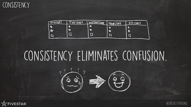
9. Consistency
If what you deliver to your students on Monday looks totally different than Friday, you've lost your audience. Keeping things the same helps with the flow. People are creatures of habit. If students know to click this specific thing to start every time, then they just do it. You don't have to tell them. You should be consistent in your colors, your fonts, your icons you use for specific things, where your instructions for each assignment is located, etc. Don't make people waste energy trying to find where things are.Staying consistent helps eliminate the unknowns, which makes your communication so much faster and easier on the user.
*Yes you can still switch things up. Sometimes things need to be changed and updated. Just don't do it too often.
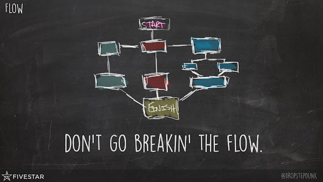
10. Flow
If I had to pick two of the ten to focus on, it would be User Experience (because everything can be driven from there) and Flow.
You want your learners to get into a flow.
You don't want to break the flow. One little thing out of whack can derail a very detailed thought process.
How are you making it easy to get into a flow? Are you using some sort of module where students go to the next assignment level? Do you have it posted at the end of the assignment what to do next? Where do they submit? Is this the end? How many steps are needed? What step are they on? Do they stay within the LMS? Do they have to open a lot of tabs?
Recap
While this is geared toward educators, it most certainly can be used anywhere.You are a designer.
You need to communicate in a way that helps learners understand easily.
Use some of the above to enhance your communication.
Your learners will learn more effectively.

Share this with your friends.
Add a comment below if you found this valuable, if you have a question, or if you have any ideas for my next post since I just picked back up blogging.